Decoding the AMPP Name and Logo: Symbolism and Meaning
AMPP BRAND · IDENTITY · MATERIALS PROTECTION
The AMPP name and logo are designed to reflect a global community focused on protecting assets, advancing materials performance, and supporting the science behind corrosion control and protective coatings.
AMPP stands for the Association for Materials Protection and Performance. Through education, credentialing, accreditation, standards, technical resources, and industry collaboration, the association brings together professionals working to improve the durability, reliability, and performance of materials and infrastructure around the world.
MORE THAN A MARK
The AMPP logo tells a story about protection, science, and global connection.
Its shapes and colors were selected to visually represent the ideas at the center of the AMPP community and its work.
Symbolism Through Shapes
Two geometric forms sit at the center of the AMPP logo: a circle and a hexagon. Together, they communicate ideas of global reach, science, strength, and protection.
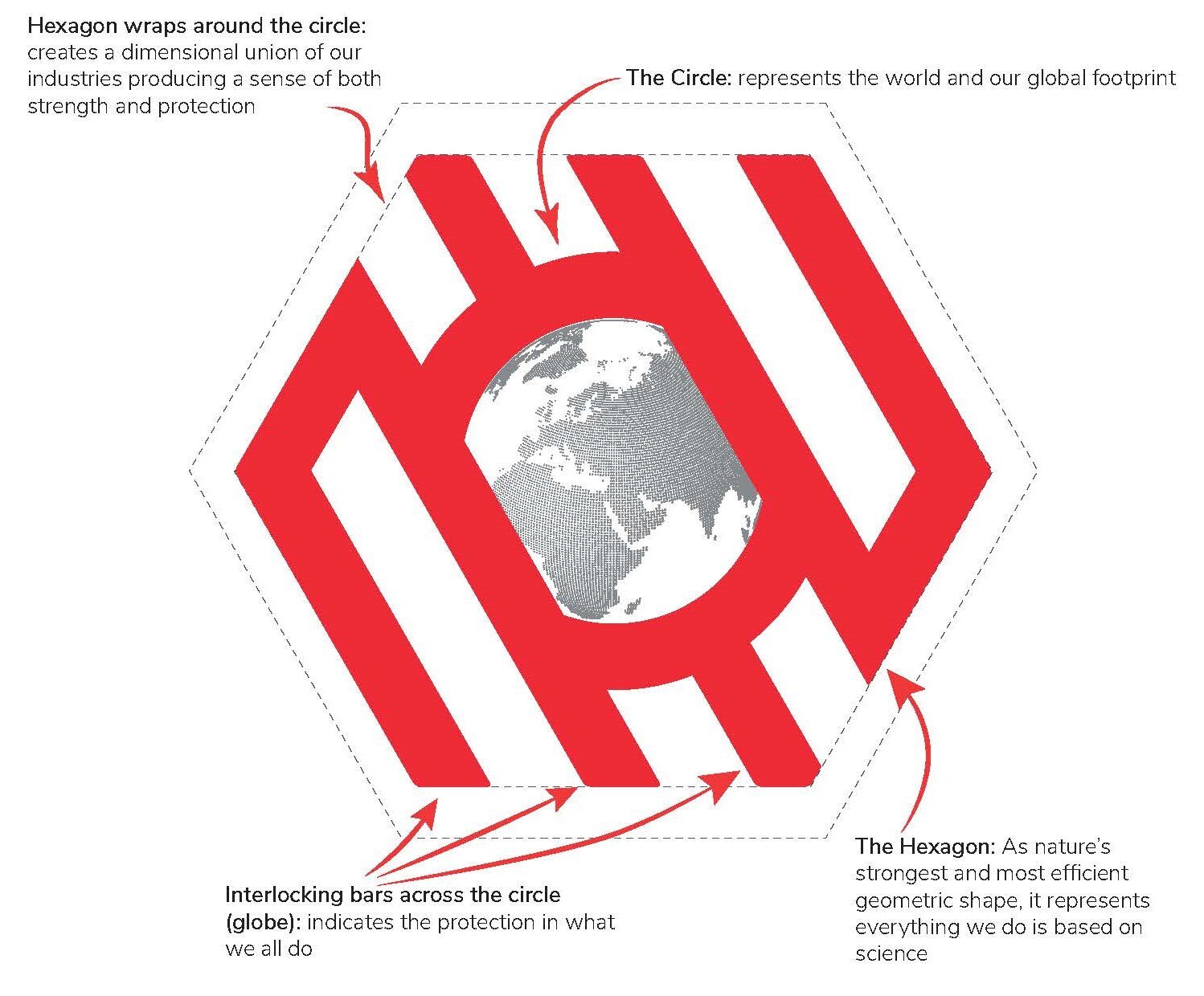
01 · THE CIRCLE
Global connection
The circle represents the world and reflects AMPP’s global scope. It also suggests connection, inclusion, and the idea that materials-protection challenges cross industries, disciplines, and geographic boundaries.
02 · THE HEXAGON
Science and strength
The hexagon reflects science, structure, and strength. Its geometry reinforces the technical foundation behind corrosion control, coatings, cathodic protection, materials selection, inspection, and other materials-performance disciplines.
03 · THE UNION
Protection through collaboration
As the hexagon surrounds the circle, the combined shape represents protection around the world. It also reflects the role of collaboration—bringing together technical expertise, industries, and professionals to help protect assets and improve performance.
THE IDEA IN ONE VIEW
Global Community
+
Science & Innovation
↓
Materials Protection & Performance
The Meaning Behind the AMPP Colors
Color plays an important role in the AMPP visual identity. Red, black, and shades of gray work together to create a brand that feels energetic, technical, confident, and practical.
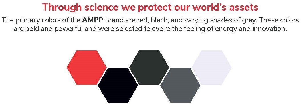
RED
Energy and action
Red represents energy, momentum, and a proactive approach to advancing materials protection and performance.
BLACK
Strength and authority
Black reinforces confidence, resilience, professionalism, and the technical authority associated with the AMPP community.
SHADES OF GRAY
Balance and practicality
Gray provides visual balance and reflects practicality, precision, and the methodical nature of technical work.
How the Logo Connects to the AMPP Mission
The strongest brand identities connect visual design to organizational purpose. In the AMPP logo, the combination of global imagery, technical geometry, and strong colors reinforces the association’s focus on materials protection and performance.
That purpose extends across education, certification, accreditation, standards development, research, technical communities, advocacy, and the exchange of knowledge among professionals working to protect physical assets.
PROTECT
Safeguard assets
Support practices that help manage deterioration and improve the durability and reliability of infrastructure and equipment.
ADVANCE
Strengthen technical knowledge
Support education, research, standards, and professional development across materials-protection disciplines.
CONNECT
Bring professionals together
Create opportunities for people across regions, industries, and specialties to exchange ideas and experience.
PERFORM
Improve materials performance
Help professionals make informed decisions that support asset performance throughout the lifecycle.
Watch the Story Behind the AMPP Brand
See how the AMPP name and visual identity connect to the association’s role in materials protection and performance.
A Visual Expression of the AMPP Community
The AMPP logo is intended to communicate more than a name. Its circle, hexagon, and color palette represent the ideas of global connection, technical strength, protection, and progress that shape the association’s identity.
Together, those elements reflect a community working across industries and disciplines to share knowledge, advance materials-protection practices, and support the performance of assets around the world.
BOTTOM LINE
The AMPP logo brings together the ideas of a global community, scientific strength, and the protection of materials and assets.
DISCOVER AMPP
Learn More About the AMPP Community
Explore AMPP’s work across education, standards, technical resources, membership, and the materials-protection profession.
EXPLORE MORE
Get to Know AMPP
About AMPP →
AMPP Membership →
AMPP Education →
AMPP Standards →
Corrosion Reference Library →

Have photos or videos from the field? Submit them to AMPP →